A year ago, I won a a giveaway for a long-distance remodel from the amazing Kristin at Bien Living Designs. Remember that? (Post is here.) Man, that feels like a long time ago. I decided to use Kristin's service to redecorate our master bedroom. The way Kristin's service works is that I gave her pictures and info on the room, then gave her all the details about my taste, my color ideas, my budget, etc. and she gives me a presentation with her ideas for furniture, artwork, floor plan, colors, accessories, etc. with links to all the items and prices. Then it was up to me to buy what I want/like and implement her plan on my own time frame. It was perfect for me.
So, let's get right into the BEFORE pictures. It almost makes me cringe to look at these photos and think that we lived with this horrible room for so long. This make-over was WAY overdue. As you walk into the bedroom, this is what you saw...
So, let's get right into the BEFORE pictures. It almost makes me cringe to look at these photos and think that we lived with this horrible room for so long. This make-over was WAY overdue. As you walk into the bedroom, this is what you saw...
Yeah, I know. It's bad.
The room is white (and very bright), which can make sleeping in hard on weekends. The furniture is temporarily borrowed from Ryan's parents, just until we could find something else that we loved. The TV is old and giant and sitting on a printer stand from my office set, the rest of which is downstairs in the actual office. And the end tables are mix-matched cheap tables that came from who the hell knows.
The bones of the bedroom are really great though. It’s a large room, with good natural light, big windows, white wooden plantation shades and hardwood floors. The previous owners had two of the most hideous gold wall-mounted bedside lights that I’ve ever seen next to the bed and they had to go first thing.
The room also didn't have any overhead light – just a really ugly white ceiling fan. I hate ceiling fans, but my husband loves having a fan in the bedroom while he sleeps, so we decided to stick with a fan. However, I wanted a ceiling fan upgrade, if we could find something prettier (and with a light).
Kristin's first question to me was, "What is your style and what do you want your space to feel like when entering?" I told her I’d like our bedroom to feel fresh, clean, romantic and classic. I’m pretty conservative when it comes to decorating - I like traditional pieces, dark wood, rich colors, clean lines. But I also wanted to mix things up a bit. I want to find a happy medium between too matchy-matchy and too random/hodge-podge. I want to walk into the bedroom and feel relaxed and cool and peaceful (dare I even say, sexy?). The bedroom may be clean every now and then (when we have company coming over), but usually it was a disaster with clothes everywhere and piles of junk and it just completely stressed me out. I want peace.
Question #2 was about a color scheme. This one was hard for me. I was all over the place. My whole house is pretty "warm" with browns and greens and tans. I love those colors, but I wanted something different. I loved the idea of doing something with grey. That just sounded romantic and cool and calm. And with the grey, I wasn't sure about an accent color, but I loved the idea of doing metallics (silver, gold, pewter, etc.). Crazy? Maybe.
Kristin also asked if there was anything in the room that we wanted to keep. The only thing I wanted to keep were our white bedding and linens. Our plain white/cream linens and sheets were wedding gifts, so I wanted to keep those. I just love white linens. They always feel so fresh and clean and crisp. We use a white quilt in the summer months and a big down comforter with a white duvet for the colder months.
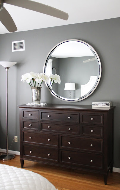
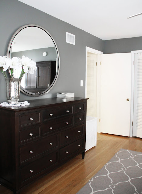
I also mentioned to Kristin that I'd finally (after years of searching) found the bedroom set that I wanted and it was ordered and being made in the Ethan Allen processing plant as we spoke. This was August and it wasn't going to be delivered until at least December, so we had time to work on getting everything else in place. I had purchased two dressers from Ethan Allen's American Artisan collection, both in chocolate with brushed nickel knobs. One was a long and short chest of drawers and the other was a tall combination dresser/media cabinet. I also ordered a large round silver mirror to go over the long dresser. Ryan’s job would be to find a new flatscreen TV for the media armoire. That boy loves his flatscreens.
These are the dressers in another color.
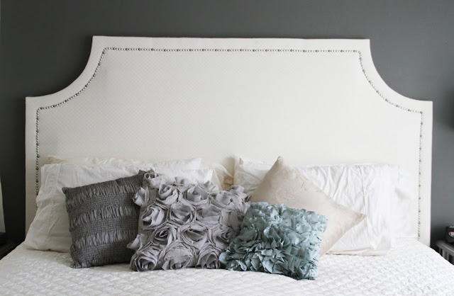
I also told Kristin that I wanted to mix some modern elements in with the traditional furniture I bought. I loved the dark wooden headboard and nightstands that went with the dressers, but I thought that might be overkill – too much dark and heavy wood. So I bought the bright round silver (almost retro looking) mirror (also from Ethan Allen). And I was was thinking about glass/silver/mirrored end tables, but I didn't really know. And finally, I wanted an upholstered headboard, if possible. Something big and dramatic and pretty. I found one at Restoration Hardware that I loved, but it was way out of my budget.
So, with all that, Kristin was ready to go. I figured that she really had her work cut out for her with this one, but she turned the project around in no time. The very first thing we did was pick a wall color. Kristin suggested Benjamin Moore's Amherst Grey, which I instantly fell in love with. It's a gorgeous rich grey shade with a slight hint of brown that would match the furniture. She said that the dark walls would add in instant glamour to the space and it definitely did.
I bought the paint that day and immediately called in my recruits to help with the painting.


So we had a color. Perfect. Next step would be accessories and decor. This is what I needed the most help with. So here is the visual presentation of accessories that Kristin gave me.
Awesome, no?
I loved it.
Kristin said she went back and forth on an accent color to go with the grey and finally settled on this deep turquoise/jewel tones. It looks great together! She said that she found a lot of inspiration and products at West Elm, which would add the perfect modern touch to my more traditional furniture. She gave me links to all the items presented and explained how to best incorporate them in to the room.
Now it was just up to me to implement the design and make the space my own. I loved having a starting point for all of this and an idea board for inspiration. It helped so much! Of course, our tastes are a little different and I changed my mind about a couple things here and there, but the main concept of the room held.
Sooooooooooooooo....are you ready for the AFTER pictures?
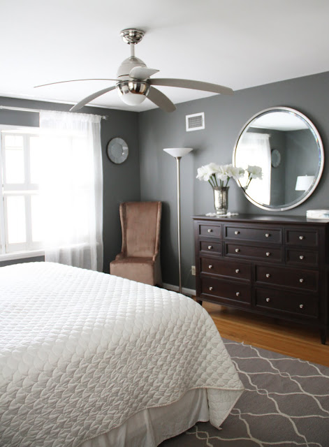
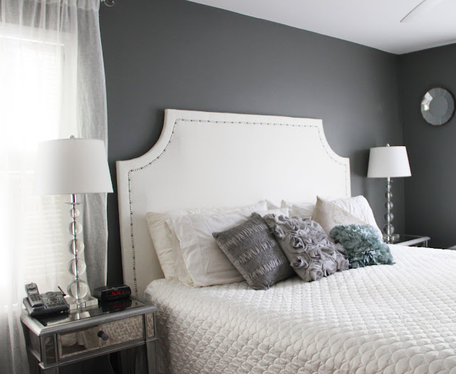
Here's the finished product!
Do you love it?!!! I do.
Kristin suggested this Jill Rosenwald Rug (Fallon) for the room in turquoise. I loved the idea, but I just couldn't pull the trigger on buying a turquoise rug. I'm such a decorating wimp! I have such a hard time being daring! So, I went with the same run in gray. I just thought I might be able to use the rug again somewhere else, should I decide to redecorate in the future. Gray is neutral...turquoise was just too scary for this girl.

I went to Lowe's to pick up the ceiling fan that Kristin suggested, but I couldn't find it. And then I saw this silver one and loved it, so I bought it instead. It's the only ceiling fan I've ever liked.
Kristin gave me the link to these gorgeous sheer linen window panels from West Elm. I went with the plain ivory ones, long enough for them to slightly pool on the ground. This added great height to the room and fills the room with a romatic gauzy diffused light. The mirrored nightstands were perfection. Exactly what I was looking for. The pillows are from all over. Although I did get the Deconstructed Rose pillow from West Elm that she suggested. Love it! Kristin also picked these stacked ball glass lamps with white shades, which are gorgeous!
The headboard.is one of my favorite parts of the room.
It's DIY, y'all!
Yes, I made it!
And I'm pretty proud of it!
I'm so happy with the result.
Tutorial HERE!
The chair in the corner is velvet with a beautiful sheen of pewter/gold. It looks brown in the pictures, but it's not really that brown. It was a find from Hayneedle. I need to get a white/grey pillow to put in the chair.
The two smaller hanging mirrors were from Pottery Barn, but are no longer available. I thought they pulled the silver and gold elements of the room together nicely. The silver jewelry box was a gift from my parents. And the mercury vase (similar to this Anthropologie one) is something I found at on the clearance shelf for $5. And yes, that's a doily! My grandmother made it.
Ryan also did his job and got us all set up in the audio/visual department.
Wall mounted flat screen that pulls out and rotates.
Not too shabby.
And there you have it.
It's not completely finished, but close enough. And since it's been a full year since I last blogged about this, I figured it was finally time to give you an update.
I definitely think it has the fresh, clean, romantic, classic look I was going for.
It no longer stresses me out.
I'm at peace in this room.
So, remember what it looked like before?
No? Me either, I've been trying to forget.
No? Me either, I've been trying to forget.
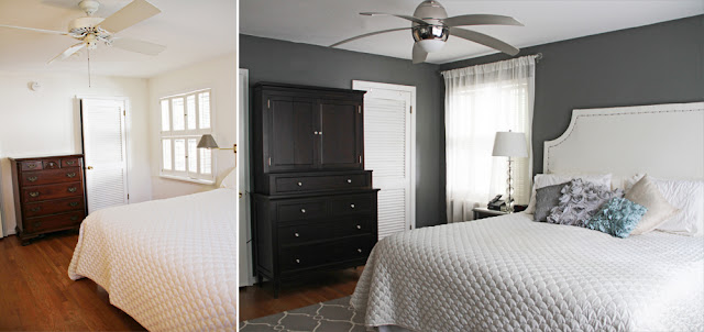
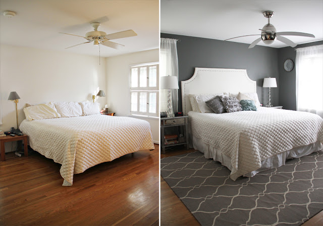
I love before and after shots, here they are.
I can't even believe it's the same room.
What do you think?
Do you like it?
Rug: Jill Rosenwald (Fallon in Gray)
Ceiling Fan: Allen & Roth
Headboard: DIY
Pillows: Desconstructed Rose Pillow
Lamps: similar here
Nightstands: Hayworth from Pier One
Furniture: Ethan Allen American Collection
Large Round Mirror: Ethan Allen
Small Mirrors: similar here
Mercury Vase: similar here
Curtains: Sheer Panels from West Elm
Chair: The Foundary
Paint Color: Benjamin Moore Amherst Gray








Oh my goodness! I LOVE IT! It looks so fabulous, if only I had the time & money to do a complete master bedroom makeover!
ReplyDeleteWOW! That's the only word needed. I'm loving gray, so this room rocks! I also love fresh white bedding, the teal color is fabulous, and it all ties together! I also wonder how to mix woods and other elements, but this is perfect! I want this exact room!
ReplyDeleteWow! It looks so grown up and fabulous. I'm always so impressed by people that can see an idea and then actually find the things and implement it with their own twist. And the headboard? Amazing! You are one talented girl.
ReplyDeleteOMG times 1 million. It's not even the same room. It.Looks.AMAZING. Love the colors, love the rug...love it all!!
ReplyDeleteholy moly. it looks amazing. seriously- way to go!!!
ReplyDeleteI LOVE how it turned out! That paint color is amazing!
ReplyDeleteWhat a transformation! Looks gorgeous!
ReplyDeletefantastic transformation!!
ReplyDeletelove it.
Gorgeous! The paint color definitely makes the room!
ReplyDeleteThe transformation is incredible! And, you're the first blogger I've seen that has found/used a really cool/modern ceiling fan. So many home decor people are swapping ceiling fans for chandeliers or pendant lights and I just can't part with my ceiling fan. It's much too hot in our bedroom in the summer. And I'm totally in love with the fan you chose! In fact, I may just have to Pin this for design inspiration. :)
ReplyDeleteAMAZING! :) Great job!
ReplyDeleteGirl that looks AMAZING! It doesn't even look like the same room! Totally looks like a picture straight out of a magazine!
ReplyDeleteOh.My.Goodness. This is fabulous!!!
ReplyDeleteIt looks terrific! Very clean and elegant. Great job!
ReplyDeleteWow!! Thats an amazing transformation! I love the white and grey color scheme and the rug is gorgeous! it definitly is clean, simple and romantic with some fun accents! Great job on the headboard!
ReplyDeleteI love it!!! Love love love the rug and the color scheme, just love it! So put together but not matchy matchy. Love.
ReplyDeleteThat's AWESOME! I can't get over it. And I'm not a big fan of ceiling fans either, but I *love* that one, too! It's both contemporary and a bit retro. Love it! Great job!
ReplyDeleteOH my goodness! That looks amazing! Great job!
ReplyDeleteWow, great transformation! Although your before is nothing like our before! (ah, temporary rental homes and no money).
ReplyDeleteLOVE it! (and that fan - rockin')
Oh. My. Goodness. That is a gorgeous room! I am definitely pinning it to my inspiration board - it's just what I want my master bedroom to look like!
ReplyDeleteUm gorgeous! Love the colors and the entire design aesthetic!
ReplyDeleteI can not believe that a) that is the same room and b) that it is not straight out of a catalog! I am so ready to see more of your house!
ReplyDeleteYou wuss! You should have gotten the turquoise rug ;)
ReplyDeleteI am in awe. I love what you did with the space! It looks like something straight out of a magazine~gorgeous!
ReplyDeleteIt's really hard for me to be friends with you right now. Kidding. Sorta.
ReplyDeleteAMAZING. A-MAZE-ING. Now, come make my house pretty.
I've been waiting for you to post this so I saved reading this post till the end of the day. Yes, I'm a loser. LOL
ReplyDelete- Holy S* you MADE that headboard? It's the 1st thing I wondered where you got. That's the kind of project that I'll stick on pinterest thinking I'll do it in the future, but I know I won't. LOL I dunno why I'm surprised... after that big storage trunk, you can prob build a whole dining set.
- LOVE the colors!! I agree that the turquoise rug would've been bangin' but I get why you passed on it.
- I'm with Ryan, I think ceiling fans get a bad rap & they keep heating/cooling costs down.
- I'm really glad you left the plantation shutters, I love the look of them.
- I was gonna ask where you got the hammered vase too. $5 bucks?!
- I big fat fuzzy pink heart love Ethan Allen. I've wanted their Maison Sleigh bed since I was in high school - no joke. I'm talking '96.
- Were you going insane with grey paint & your pretty clean white bedding still on the bed under a dropcloth like that? I would've been freaking out. You get points for that.
- Ok, novel over. Good job! :)
That looks amazing!
ReplyDeleteSo I TOTALLY PINNED a lot of your bedroom pics on Pinterest!!! Hope that's okay!!! What's the name of the color/brand of paint you used on your walls!?!? Love it! Such a great job girlfriend!! !
ReplyDeletePS!! I tried to add you on pinterest via your button but it didn't work!!! :( link is broke! Just thought you should know!
ReplyDeleteOMGGG that's the same room?!!! It looks amazing!!!
ReplyDeleteWOW! It looks amazing!!!
ReplyDeleteI love it! I love you kept the white, it keeps the clean, fresh, crisp feel about the room without the grey overpowering it. Love it! Great Job!
ReplyDeleteHoly cow Sara, I LOVE IT! It's absolutely beautiful and the perfect mix of traditional and modern. I love the gray and the headboard is awesome. Fabulous job!
ReplyDeletewow it's beautiful! what an amazing job you and kristin did. i would be incredibly happy to come home to that bedroom every night. swooning!
ReplyDeleteThat looks AMAZING!
ReplyDeleteSara, the room looks GREAT! I'm so impressed!! What did you do with those gold wall lamps?! I happen to love them :)
ReplyDeleteOhmahgah ohmahgah ohmahgah!!! It's freaking GORGEOUS! So so so so lovely. It definitely looks like a brand new room...such a fantastic job you guys did!
ReplyDeleteOne of my favorite bedrooms EVER! Pure perfection.
ReplyDeleteThe new decor is fantastic! and thank you for doing the nice side by side before and after pics! The two pictures side by side from the same exact angle made it much easier to appreciate the dramatic changes to every corner of your bedroom. As much as I love HGTV and other design shows it drives me crazy when their before and after shots are from different angles, most of the time I can't really tell what I'm looking at! haha
ReplyDeletewill you please come to chicago and give our place a makeover? wow, that is amazing! looks just like a magazine spread! :) nice work!!
ReplyDeleteWOW! This is really unbelievable! It gives me hope for mine :)
ReplyDeleteMy goodness, I absolutely love it!!! I had a freakout moment when I saw how gorgeous the headboard turned out, but this post put me over the edge! It is SO BEAUTIFUL! I love the colors and finishes and everything!
ReplyDeleteI'm a little late on this... but WOAAAAAH! I LOVE what you've done with it. I'm a lover of grey walls, padded headboards, and Lucite lamps.
ReplyDeleteThis really looks like a magazine bedroom and I would take it in a heartbeat!
This comment has been removed by a blog administrator.
ReplyDeleteHi
ReplyDeleteI am considering painting my kitchen Amherst Gray, I will have white cabinets, stainless steel pulls and a light bluish/green glass backsplash. Is the color really dark in person? I am nervous,but I really love the color.
Thanks
Cheri
cherij0411@yahoo.com
I just found your site via Pinterest and I love this bedroom! Where did you get the big mirror?
ReplyDeleteThanks,
Alex
alexandraelathrop@gmail.com
I just saw your beautiful makeover on Pinterest! And wow, do I understand how a room that needs help can become so daunting that it takes years to get to it! I understand this so well, as a matter of fact, that I started a Virtual Interior Design business to help others see examples of their design choices actually in their spaces BEFORE they commit to them. I use a photo of their rooms and photos of their paint samples, furniture ideas, draperies, accessories....everything, and I create a photo-realistic composite of the choices. Once you see it, you can more readily decide! And it is very inspiring. Here's my website if you want to check it out - www.envisionmyhome.com. Best to you!
ReplyDeleteAngie H.
envisionmyhome@gmail.com
Where is the larger mirrow from, above the dress? Can you email me the details? selenahenrickson@yahoo.com
ReplyDeletelove this idea I'm stealing it ! can't wait to get started, big thanks for posting it
ReplyDeleteThis is totally crazy as you have the SAME color scheme and plan that I have been working on in our master bedroom for months!! The only thing I could not decide on was dresser color - Now I know we will be staining ours DARK! THANK YOU!!! AND you gave me the PERFECT Grey! Which is IMPOSSIBLE to find! THANK YOU THANK YOU THANK YOU!
ReplyDeleteI just found your makeover on Pinterest and LOVE what you did. I have been blocked on decorating my bedroom for over a year and your pictures so inspired me. Where did you get the big round mirror from? I LOVE it! Can you email me your source? Mpimentel4@aol.com
ReplyDeleteWhere did you get the flowers/silks for the silver vase!? They add a nice soft feel!
ReplyDeleteThis is exactly what I am looking to do with our master bedroom! Glad I stumbled onto this site!
ReplyDelete
ReplyDeleteLove, Love, Love the whole room! But I really love the big round mirror. Can you please tell me where you found it! Thanks! stokes490@gmail.com
That big round mirror is to die for!! For everyone who's asked, it's Ethan Allen and runs about $600. Unfortunately way WAY out of my price range.
ReplyDeleteLove Love Love this!! Thanks for the wall color, exactly what I was looking for. You did a fantastic job on the headboard. I would have however went with the turqoius rug!! Excellant job!!
ReplyDeleteWhere can you purchase the large mirror about the dresser? Love the whole room, very inspiring!
ReplyDeleteWhat an amazing transformation! Can you tell us where to find the rug?
ReplyDeleteWow....that looks simply outstanding!!!
ReplyDeleteI just love these dark wood bed or dark wood bedroom accessories. They always give a rich and high elegant look even your bedroom space is small or walls doesn't match to your furniture.
Keep it up!!
I'm still slowly poking around your blog but when I saw this, I knew I had to comment.
ReplyDeleteWe moved into our "forever" home last September and completely re-did the master suite. I'm starting to think we have very similar taste...
http://www.sittinginatree-blog.com/2012/10/before-afterish-master-bedroom.html
Found you through pinterest. love it!! such a pretty space. you must truly love it.
ReplyDeleteWhat a beautiful transformation...everything looks so warm and lovely.It looks like you've put alot of thought into it too.online beds company UK
ReplyDeleteThis comment has been removed by the author.
ReplyDeletelove this idea I'm stealing it, thanks for sharing.Internet based beds company
ReplyDeleteDamn girl... you are no decorating whimp. You've got the eye for sure. ;^)
ReplyDeleteI know this is a post from forever a go but I just love your room! We have a very similar paint color in our room but I have yet to decorate it (we're still unpacking boxes :/ ). I love how you decorated everything! That rug and headboard are fab!! This is a great room!
ReplyDeleteAlso, we give the intelligent tips to keep your furniture upholstery clean and healthy by suggesting you to use the quality cleaning and moisturizing products that provide your leather item persistent glow.
ReplyDeleteFor more information kindly visit:- Furniture Repairs London
OMG!!! I love this!!!!! You did an amazing job! It looks like something right out of a magazine!!! Total inspiration for when I get a home!!! Big props to you lady!!!!
ReplyDeleteWhere is the round mirror about your dresser from? LOVE
ReplyDeleteGreat post! Been reading a lot about designing my master bedroom. Thanks for the info here!
ReplyDeleteHey! , o love this room! Woow amazing colors and ideas, thanks for the inspiration! I loved your ceiling fan, sodid you say ots from Lowes im trying to look for it and cNt find it ! :(. Please help!!
ReplyDeleteJust stumbled across your blog, and I love this post!!! what a great re-design!
ReplyDeleteThis comment has been removed by the author.
ReplyDeleteWhere did you get the dresser?
ReplyDeleteWow that transformation is amazing!! I have been wanting to try a DIY headboard once we get a new bedroom set, yours came out great. Stopping by from the blogger life :)
ReplyDeleteLove this! It looks like such a different room... the grey adds so much warmth (which sounds weird for me to say about a gray)!
ReplyDelete-Kara {BorrowedBlessings}
I sent your articles links to all my contacts and they all adore it including me. look at this site
ReplyDeleteExactly, you're very kind of us about comment!. Bair hugger infection
ReplyDeleteGood work on this post! I really like the way you delivered your qualitative facts and how you made this fascinating and effortless to realize. Thank you!! Cuddly Home Advisors
ReplyDeleteThis comment has been removed by the author.
ReplyDeleteMy grand father Mr. Ron Peterson says me that when you going to change the bed mattress of master bed room, but when you going to change the mattress you should buy a good high quality and soft mattress for your master bed room, so when you and your wife going to sleep on bed then she will enjoy to sleep in your bed and then she will very happy from you.
ReplyDeletedid you use semi gloss or egg shell paint?
ReplyDeleteThis is awesome!!!
ReplyDelete